Refreshingly
Light
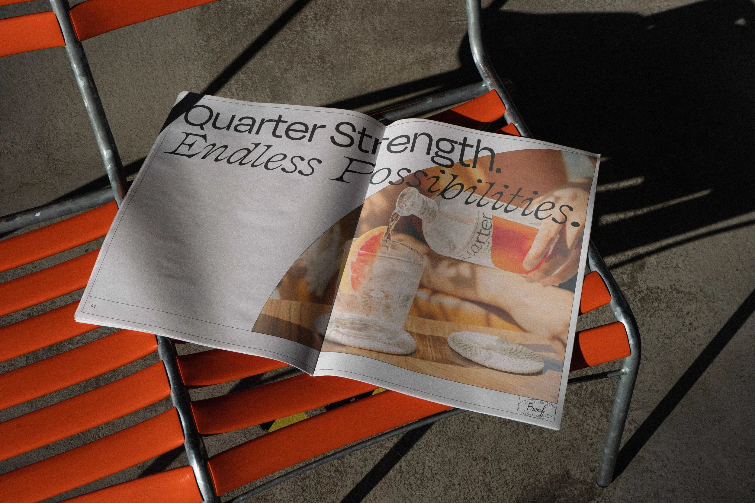
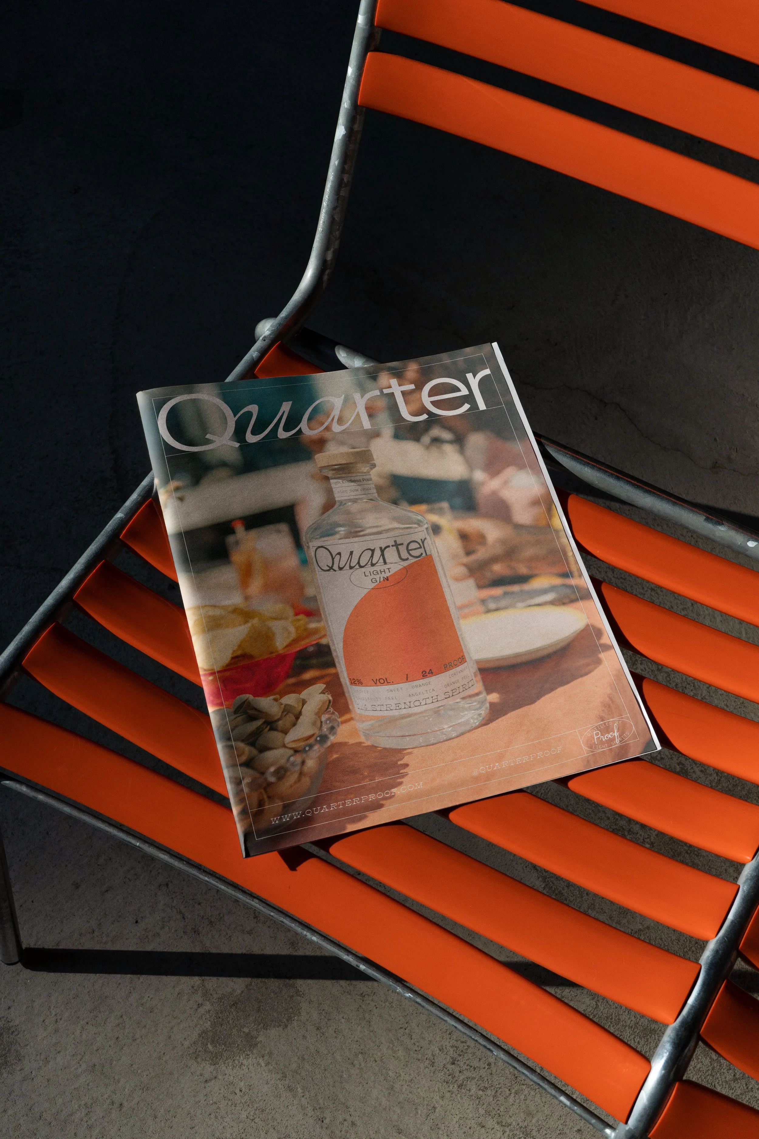
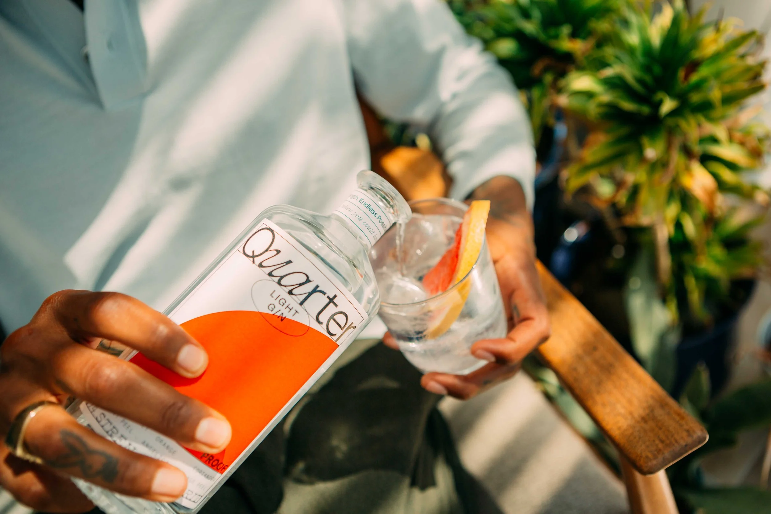
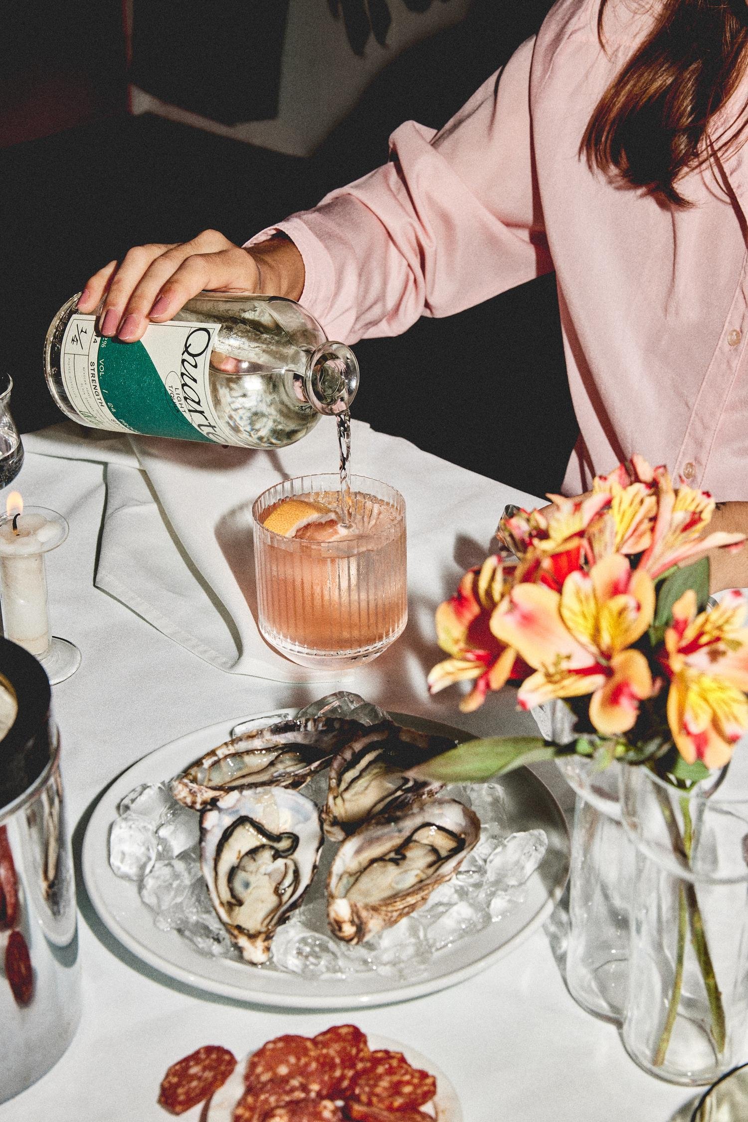
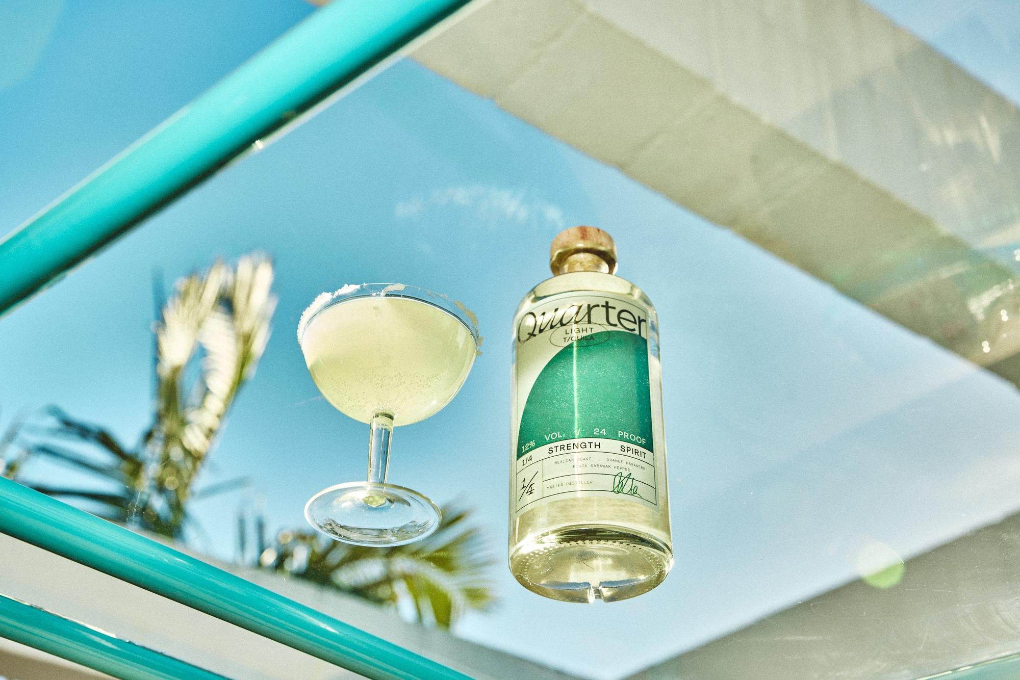
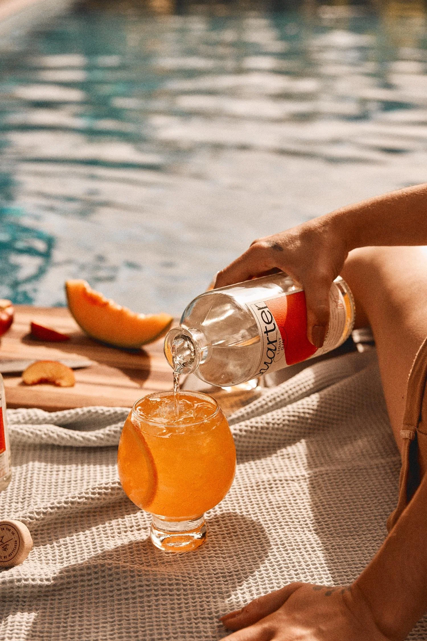
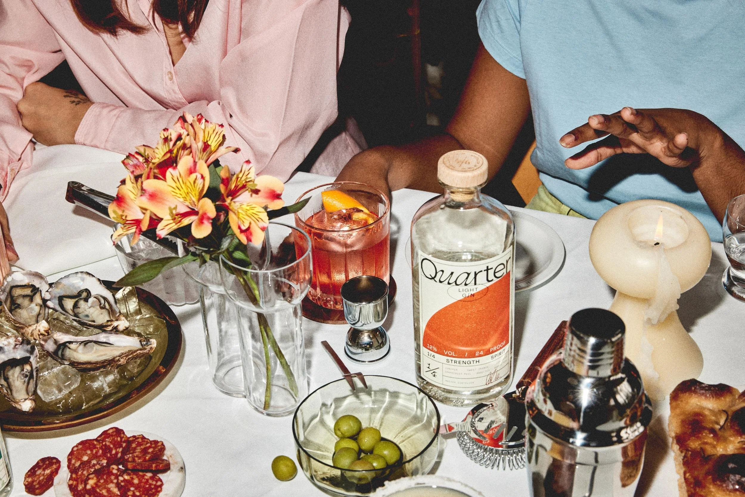
Figuratively speaking the question has always been ‘water or wine’ — but why does it have to be all or nothing? Now there’s a third choice and it looks pretty handsome. This is Quarter; it’s Gin as you know it, but with a fraction of the alcohol. Mirroring the fractioned alcohol content of the product, our visual identity for Quarter finds the sweet spot between moderation and creative flair. A bespoke crafted logotype and expressive typographic moments keep the curiosity alive in an otherwise structured design system. The result is a measured solution to the cultural balancing act alcohol creates.
-
Brand Identity
Storytelling
Packaging
Website
Art Direction
Digital Design
Illustration -
Photographers: Charlie Mckay, Jimi Herrtage
Developer: Undefined -
IG: @quarterproof
WEB: quarterproof.com