A love letter to sakE
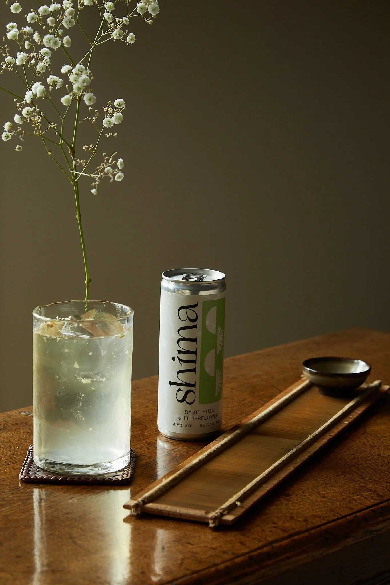
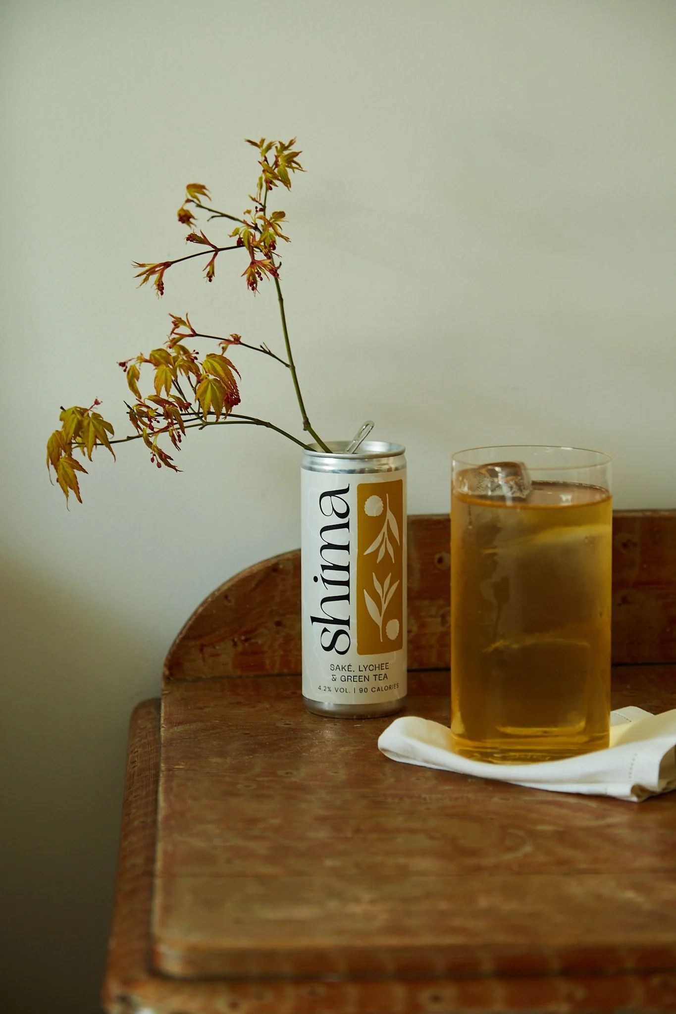
Shima is born from the islands, fusing the finest flavours of the East with the familiar tasting notes of the West, the brand connects the cultural dots. At the heart of the brand, Shima is about actively seeking out the details and celebrating the traditions and rituals that come hand in hand with discovery.
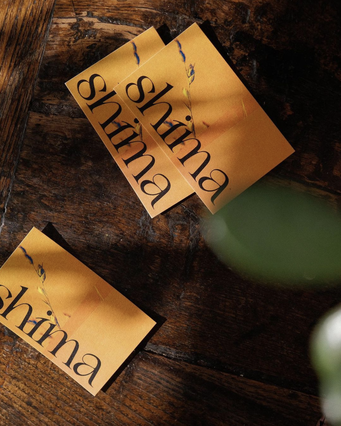
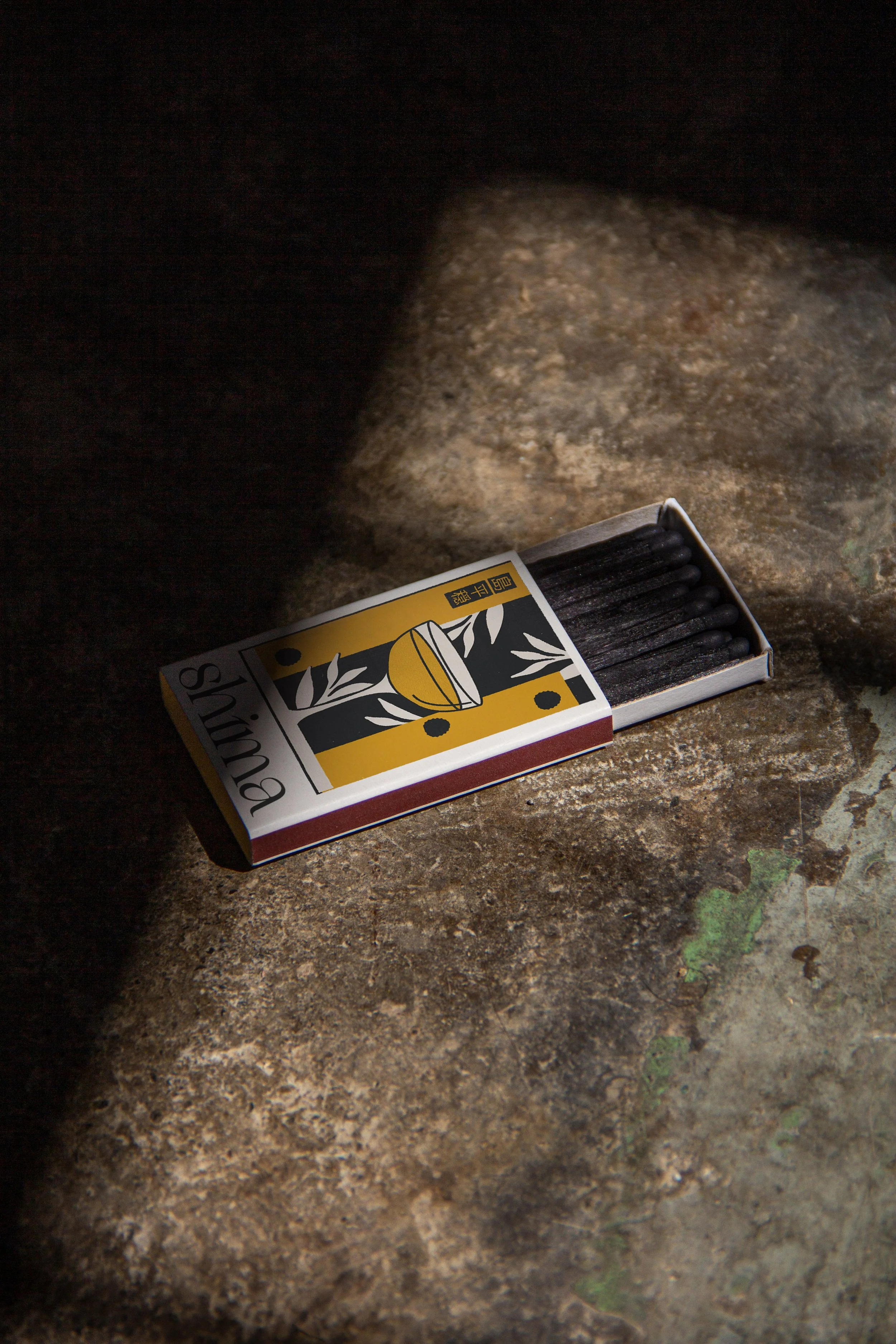
The Shima identity is inquisitive, confident and playful, with flavour combinations that intrigue and delight the senses. Through a collaged and layered visual language we communicate the rich history and respected traditions that lie beneath the surface. These textural elements are paired with editorial typography layouts, building a brand world that emulates tradition with a twist.
-
Brand Identity
Storytelling
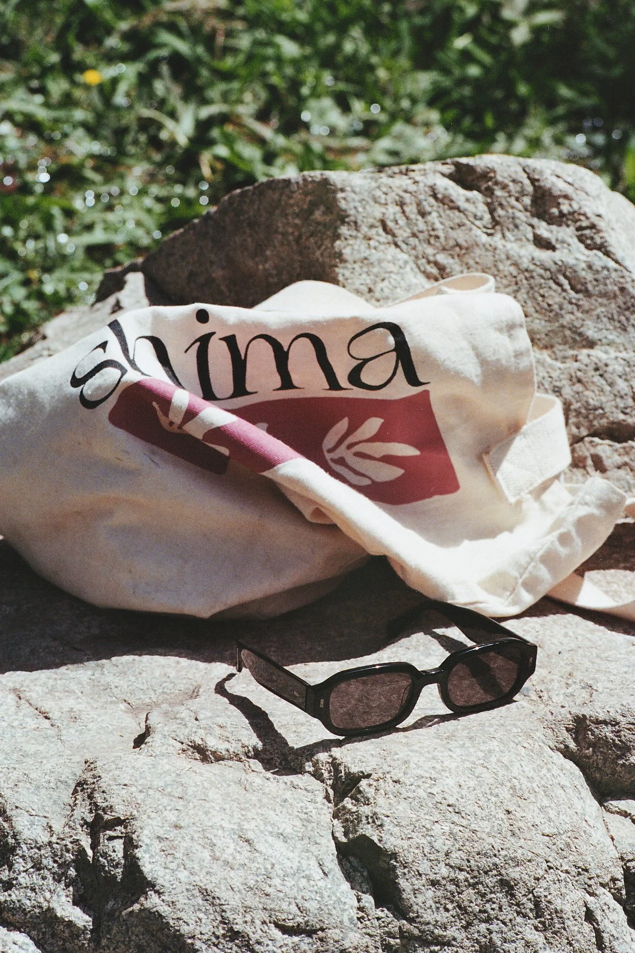
Print & Packaging
Art Direction
Website
Illustration
Digital Design -
Photography: Helena Dolby, Beca Jones
Developer: Amadea Kimmins -
IG: @shima.drinks
WEB: shimadrinks.com